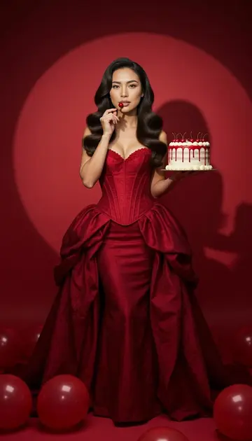
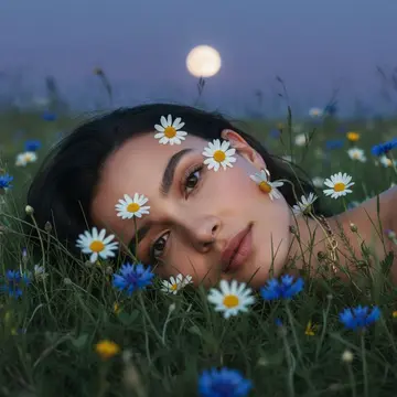
Qwen-Image 3.0 is the third generation of Alibaba's Qwen image model, built to turn long, structured briefs into information-dense images: posters, infographics, menus, newspaper pages, slides and storyboards. Alibaba says it accepts instructions of up to about 4,500 tokens, renders text as small as 10 pixels and writes natively in 12 languages, including Chinese and English in the same image. The prompts below are written the way it likes to be briefed: the layout first, then each block of content, then the style. Choose Qwen-Image 3.0 in the Luren AI image model list and paste any prompt below.
Describe the layout before the content: the format, the grid, and what sits in the header, the body and the footer.
Write every piece of text exactly as it should appear, in quotation marks, and say which language each line is in.
Break a long brief into numbered sections, one per panel or block, so each part of the image has its own instructions.
For bilingual designs, give the Chinese and English lines as pairs and say how they relate, for example the Chinese title large with the English line smaller beneath it.
Finish with the visual style in one or two sentences: palette, typefaces, illustration or photo, and how much white space to leave.
Posters and covers
01
Bilingual tea festival poster
A vertical 2:3 poster for a spring tea festival. Layout: a large title block at the top, an illustration in the middle and an information strip at the bottom. Title: the Chinese "春茶节" in large brush calligraphy, with the English "Spring Tea Festival" in a thin serif beneath it. Middle: a watercolor of terraced green tea fields in morning mist, with two pickers carrying baskets. Bottom strip, left to right: "Tastings", "Workshops" and "Live Music", each with a small line icon, and the dates "April 12–14" on the right. Soft greens and cream, lots of white space.
02
Magazine cover from my photo
A magazine cover made from my photo. Me in the center from the waist up, keeping my face and hair exactly as in the photo, against a plain warm grey backdrop. Masthead across the top in tall black serif letters: "NORTHLIGHT". Cover lines down the left side, each on its own line: "The Slow Travel Issue", "12 Cabins Worth the Drive", "How to Pack Light". A small line in the bottom right: "Autumn 2026". Clean, editorial, generous margins.
03
Short film festival poster
A 2:3 poster for a short film festival. Top third: the title "Small Screens, Big Stories" in bold condensed white letters on deep blue. Middle: a stylized film reel unspooling into a city skyline at night. Bottom third, in three aligned columns: "Friday · Opening Night", "Saturday · Shorts Marathon", "Sunday · Awards". Footer in small type: "Riverside Arts Centre". Flat graphic style in deep blue, gold and white.
04
Novel cover
A book cover for a novel titled "The Lighthouse Keeper's Daughter". Layout: the title in the upper third in an elegant serif across two lines, and the author name "Mara Ellison" at the bottom in small capitals. Image: a lone lighthouse on a cliff at dusk, a girl in a yellow raincoat on the path below, and a stormy teal sea. Painterly and atmospheric, with a subtle paper texture.
05
Jazz night poster in two languages
A square concert poster for a jazz night. Center: a saxophone player silhouetted against a large orange moon. Top: the English title "Moonlight Jazz" in a retro script, with "月光爵士夜" directly below in a matching weight. Bottom: "Friday 9 PM" and "星期五 晚上九点" side by side, separated by a thin vertical line. Screen-print texture in orange, navy and cream.
Infographics and explainers
06
3×3 sleep tips grid
A square 3×3 grid of nine infographic cards about healthy sleep, all the same size with thin rounded borders. Each card has a small flat icon at the top, a bold heading and one short, accurate tip beneath it. Headings in order, left to right and top to bottom: "Keep a Schedule", "Morning Light", "Cool Room", "Less Caffeine", "Screens Off", "Wind Down", "Dark Bedroom", "Move Daily", "Short Naps". Calm navy and lavender palette, one consistent icon style.
07
Four ways to brew coffee
A landscape infographic titled "Four Ways to Brew Coffee" with four equal columns: Pour-Over, French Press, Espresso and Cold Brew. Each column has an isometric drawing of the equipment at the top, then three labeled rows. Grind: medium-fine, coarse, fine, coarse. Time: 3–4 minutes, 4 minutes, 25–30 seconds, 12–24 hours. Taste: a three-word description for each. Thin dividers between columns, warm brown and cream palette, clean sans-serif type.
08
Planets in order
A wide 16:9 educational chart titled "The Planets in Order". The Sun as a large glowing arc on the left edge, then the eight planets in a row from Mercury to Neptune, drawn roughly to relative size, each with its name beneath it. A small note under the row: "Sizes approximate, distances not to scale". Dark navy background, softly lit planets, white labels.
09
Bilingual recipe card
A vertical recipe card for "Tomato and Egg Stir-Fry" with the Chinese name "番茄炒蛋" beside the title. Section 1, Ingredients: five items with small drawings: 3 tomatoes, 4 eggs, 2 spring onions, 1 tsp sugar, a pinch of salt. Section 2, Method: four numbered one-line steps with a small drawing each: beat the eggs; scramble them and set aside; cook the tomatoes until soft; return the eggs, season and add the spring onions. White background with red and yellow accents.
10
Kettle product sheet
A one-page product sheet for an electric kettle called "Brio". Left half: a clean studio photo of a matte white kettle with a wooden handle. Right half, top to bottom: the product name in large type, the tagline "Boils fast, pours clean", then a four-row table of labels and values: Capacity 1.7 L, Power 2200 W, Temperature presets 5, Body stainless steel. Minimal Scandinavian design on a light grey background.
11
Pythagorean theorem slide
A 16:9 lecture slide titled "The Pythagorean Theorem". Left: a right triangle with its sides labeled a, b and c, and a square drawn on each side. Right: the formula a² + b² = c² in large, clean math type, and below it a worked example: 3² + 4² = 9 + 16 = 25 = 5². White background, dark blue text, one orange highlight on the hypotenuse.
Newspapers, menus and storyboards
12
1920s newspaper front page
The front page of a 1920s-style broadsheet called "The Harbour Gazette". Masthead across the top with a date line beneath it. Lead headline in large bold type: "Lighthouse Relit After Fifty Years", with a sepia photo of the lighthouse below and two columns of body text. A narrower right-hand column with two short stories: "Fishing Fleet Returns Early" and "Town Band Wins Regional Prize". At the bottom, a small weather box and an advertisement for a bicycle shop. Aged paper, letterpress texture, readable headlines.
13
Chalkboard café menu
A landscape café menu with three sections side by side: "Coffee", "Tea" and "Pastries". Under each heading, five items, each with a one-line description in smaller type, for example "Flat White: double ristretto, silky milk". Chalkboard background, hand-drawn chalk lettering, and small doodles of cups and croissants between the sections.
14
Bilingual noodle shop menu
A tall bilingual menu card for a noodle shop. Header: "兰州拉面" in large brush lettering, with "Lanzhou Hand-Pulled Noodles" beneath it. Four dishes in two aligned columns, Chinese on the left and English on the right: "牛肉面 / Beef Noodle Soup", "拍黄瓜 / Smashed Cucumber Salad", "羊肉串 / Lamb Skewers", "酸梅汤 / Sour Plum Drink". A small ink drawing of a steaming bowl at the bottom. Cream paper, red and black ink.
15
Six-panel ad storyboard
A six-panel storyboard for a 30-second bicycle ad, laid out in a 3×2 grid, each panel with a shot number and a one-line caption underneath. 1: "Alarm rings, city at dawn". 2: "She grabs her helmet". 3: "Wide shot, riding over a bridge". 4: "Close-up, wheel on a wet street". 5: "Arrives at work, smiling". 6: "End card: Ride Brighter". Clean pencil sketches with light grey shading.
16
Fractions worksheet
A printable A4 worksheet titled "Fractions Practice" for primary school. Name and date lines at the top. Section A: six shapes, circles and bars, partly shaded, each with a blank to write the fraction. Section B: five addition problems such as 1/4 + 2/4 = ___. Section C: one word problem in a box. Friendly sans-serif type, a few small doodles in the margins, black and white for printing.
Your photo, with words
17
Conference badge with my photo
A portrait-format conference badge built from my photo. Top: the event name "Build Week 2026" on a coral band. Middle: my photo in a circular crop, with my face exactly as it is. Below it, the name "Sam Carter" in bold and the role "Product Designer" in a lighter weight. Bottom: a row of three small icons labeled "Talks", "Workshops" and "Dinner".
18
Travel journal page
A scrapbook-style travel journal page built around my photo. My photo as a polaroid taped at a slight angle in the upper left, my face unchanged. Handwritten title at the top right: "Three Days in Kyoto", with "京都三日" beneath it. Below, three short dated notes in handwriting: "Day 1 · Temples at sunrise", "Day 2 · Bamboo forest walk", "Day 3 · Tea in Gion". Pressed leaves, a train ticket stub and washi tape around the edges.
19
One-page résumé with my photo
A modern one-page résumé. Left sidebar: my photo as a round headshot at the top, my face unchanged, then the sections "Contact", "Skills" and "Languages" with short lists. Main column: the name "Jordan Lee", the title "Graphic Designer", then "Experience" with three roles, each with a company, dates and two bullet points, and "Education" below. Navy and white, plenty of space, crisp small type.
20
Bilingual birthday invitation
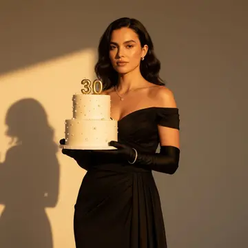
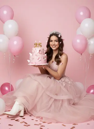
A vertical birthday invitation with my photo in an arched frame at the top, my face unchanged. Below it, "You're Invited!" in a playful script, then "诚邀您参加" in smaller type. Three centered lines of details: "Turning 30", "Saturday, 7 PM", "The Garden Room". Gold accents, a blush pink background and scattered confetti.
21
My year in review
A year-in-review collage built from my photo: the photo large in the center, my face unchanged, surrounded by twelve small tiles, one per month, each with the month's name and a tiny icon, such as a snowflake for January and a heart for February. Title across the top: "My 2026". Clean grid, pastel colors, rounded corners.
Copy a prompt, open Luren AI, choose Qwen-Image 3.0 in the model picker and paste it. Prompts that mention "my photo" expect you to add your own photo as a reference first.
Can I edit the prompts?
Yes, and you should: swap the setting, the outfit, the colours or the light for your own idea. Keep the order (subject, setting, light, camera, mood) and the model will follow you better.
Is Qwen-Image 3.0 part of Luren AI?
Qwen-Image 3.0 is made by Alibaba. Luren AI is an independent app that gives you Qwen-Image 3.0 together with other image and video models, so you can try the same prompt on several of them.
Paste it, add your photo, pick a model
Free to download on iPhone and Android. Pick a style, add one photo, and see yourself in it in under a minute.